You’re standing in a gallery, or maybe a friend’s living room, in front of a huge canvas covered in slashes of orange and heavy ridges of blue paint. Someone next to you nods slowly and says “stunning.” You tilt your head and think: is it, though? What am I supposed to be seeing here?
Here’s the secret: you’re not supposed to be “seeing” anything. Abstract art is art that doesn’t try to depict the real world. Instead of a recognizable tree, face, or landscape, it uses color, shape, line, and texture to speak to you directly, the way music does without words. This guide strips away the museum jargon and explains, in plain language, what abstract art is, why it matters, and how to tell the good stuff from filler.
Abstract art meaning: drawing away from reality
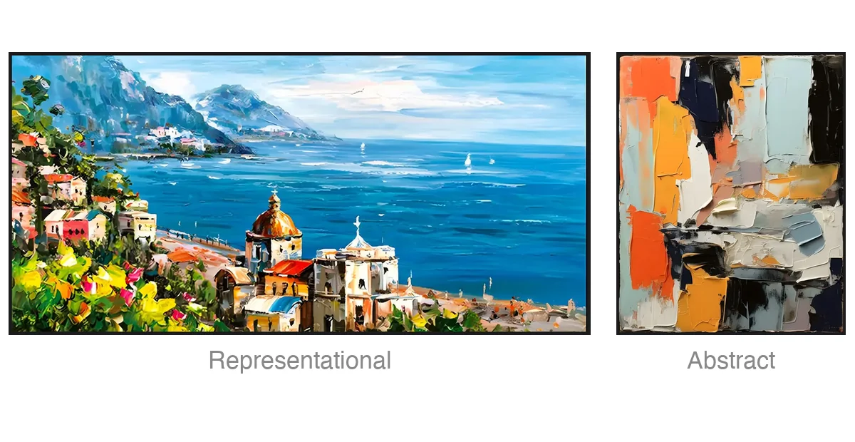
The word “abstract” comes from the Latin abstrahere, meaning “to draw away” or “to extract.” That sums up the whole idea. Rather than accurately depicting a specific, identifiable subject, abstract art uses shapes, colors, forms, movements, and physical surface textures to express emotions, concepts, and atmospheres.
The meaning of an abstract artwork therefore comes entirely from how these visual elements are organized and how they interact. The work does not need to show you a tree to make you feel something.
Here’s how the world’s leading art institutions define abstract art:
- Tate defines abstract art as work that “does not attempt to represent an accurate depiction of a visual reality.”
- Britannica notes that it uses a visual language of form, color, and line to build a composition with a degree of independence from visual references in the world.
- MoMA describes abstraction as non-representational art that does not depict objects or scenes from the world, or carry a discernible subject.
In practice, abstraction covers a broad spectrum. At one end, semi-abstract work still hints at real things, so you might trace a landscape simplified into blocks of color. At the other end sits non-representational or non-objective art, which has no reference to the physical world at all, and the painting stands entirely on its own terms. (If you’re curious what that far end looks like in practice, our pure abstract paintings live there.)
Understanding this helps you stop searching for a hidden house, tree, or face in the brushwork. Once you stop asking what the painting is “of,” you can finally see what it is: a direct conversation between the artist’s visual choices and your own perception.
The visual language of abstract art: what you’re actually looking at
If an abstract painting is not showing you a familiar scene, what are you actually looking at? Think of it like arriving in a country where you don’t speak the language. At first it’s noise; once you learn a few dozen words, conversations start appearing everywhere. Abstract art has a vocabulary too, and the true subject of any abstract painting is the relationship between these visual elements.
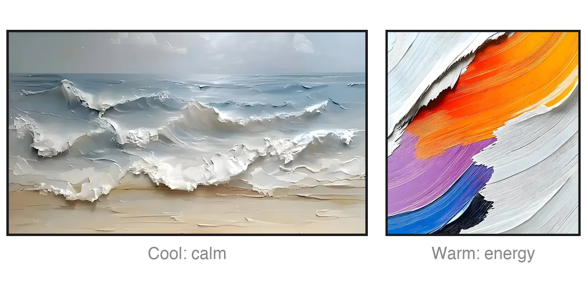
Color. This is the most immediate tool. Color bypasses our logical brain and acts directly on the nervous system, setting the mood of a room before you have time to think about it. Deep, saturated blues and muted grays instill an immediate sense of calm and introspection, while fiery oranges, rich ochres, and thick reds project energy, warmth, and motion.
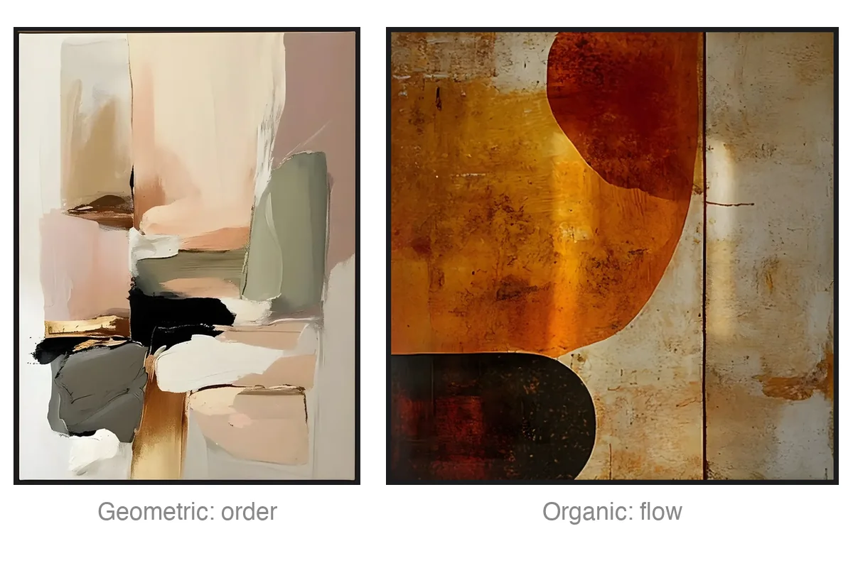
Shapes and forms. These provide the structural bones of the artwork. They can be hard-edged and geometric, offering stability and modern order, or organic and fluid, mimicking the soft, unpredictable curves found in nature.
Lines and brushstrokes. A line is a record of movement. In an abstract painting a line can be sharp, deliberate, and tense, or a loose, wandering mark that guides your eye across the canvas. The brushstroke shows you exactly how the artist moved their hand, leaving a permanent trail of human energy.
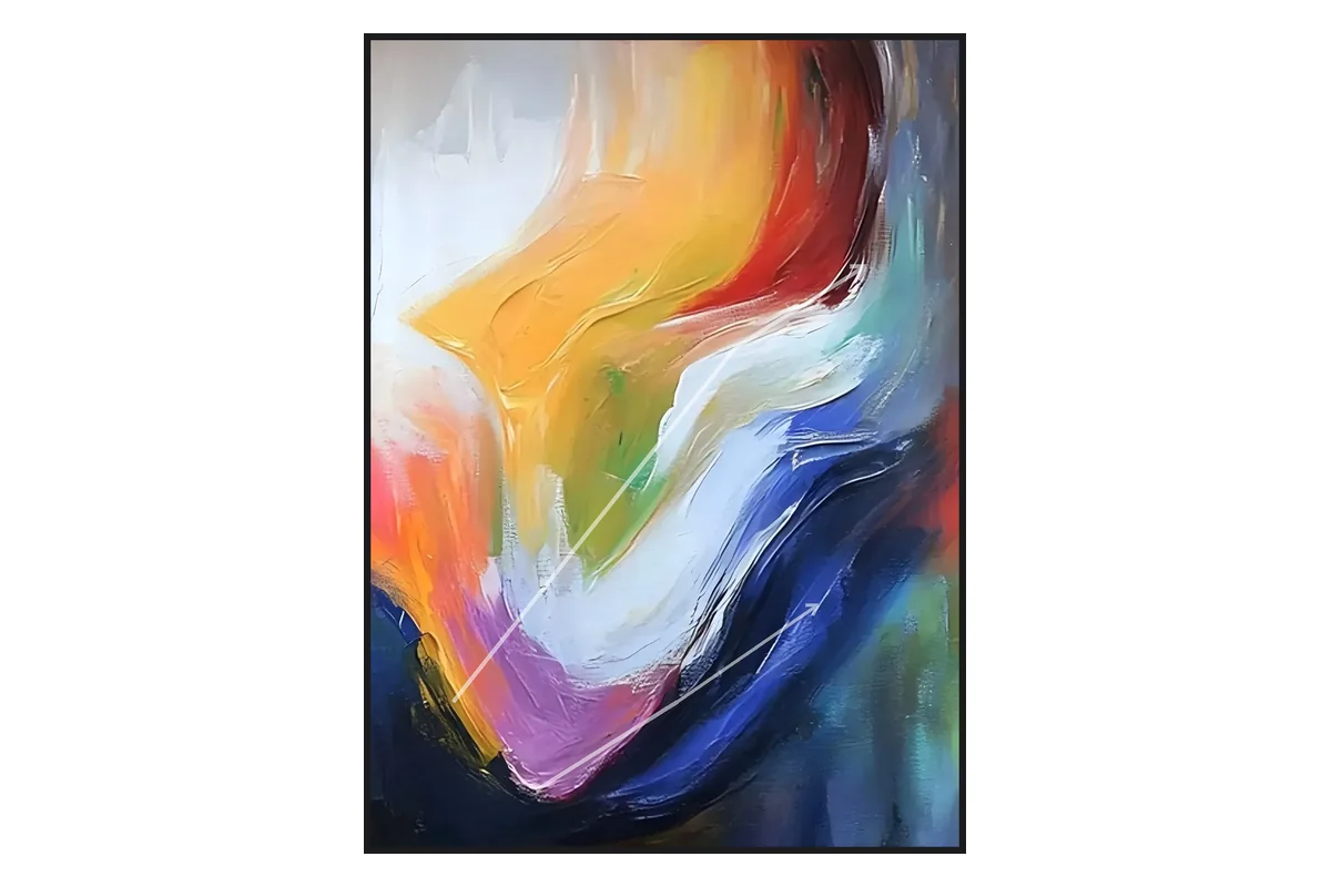
Composition and balance. This is how the weights of color and shape are distributed. A well-composed piece might feel perfectly anchored, where every element balances the next, or it might be intentionally off-kilter to create dynamic tension.
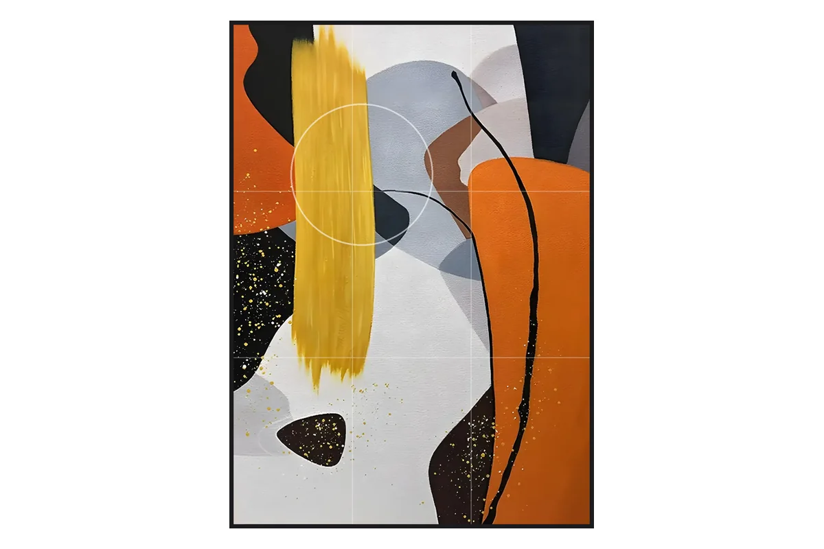
Negative space. What is left unpainted is just as critical as the areas packed with detail. Negative space gives the artwork room to breathe and keeps the composition from collapsing into overwhelming noise.
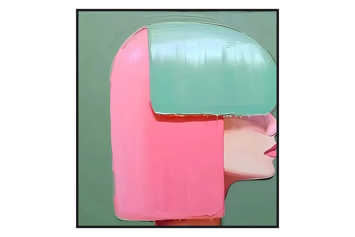
Surface texture. The physical surface, whether smooth and glass-like or built up with heavy, sculptural layers of paint, dictates how light hits the artwork. Texture adds a three-dimensional quality that changes with the time of day and the angle you view it from.
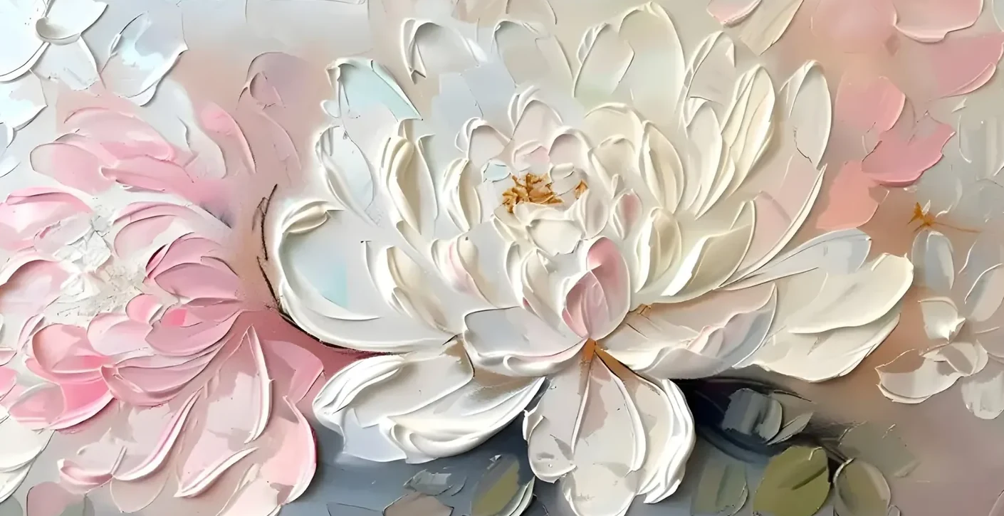
When these elements are handled with skill and intention, the painting stops being a passive “picture of something” and becomes an active presence in a room.
The main types of abstract art
Abstract art is an umbrella term covering several distinct movements and styles. Learning their names does something useful: the next time a painting stops you mid-scroll, you’ll know why it did, and you’ll know how to find more like it.
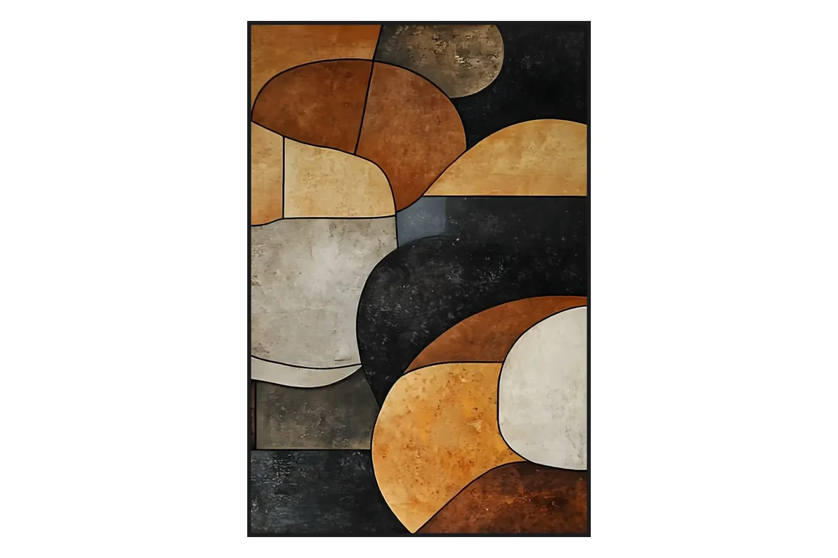
Geometric abstraction. Relies on clean, precise lines and structured shapes like squares, circles, and rectangles. Historically championed by Piet Mondrian and Kazimir Malevich, it rejects organic messiness in favor of clarity and order. (Our geometric wall art lives in this lane.)
Color field painting. Emerging in the mid-20th century and famously associated with Mark Rothko, this style features large, sweeping expanses of flat, solid, or subtly layered color, with no brushstrokes to look at and no lines to follow. The vast fields of color are designed to envelop the viewer and induce a meditative or deeply emotional state.
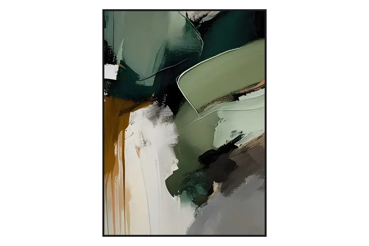
Gestural and action painting. This approach is about the physical act of creation. Made famous by Jackson Pollock and Willem de Kooning, it emphasizes energetic, visible movement: sweeps of the arm, drips, splatters, and raw brushwork. The canvas becomes an arena where the artist’s physical energy is captured in real time.
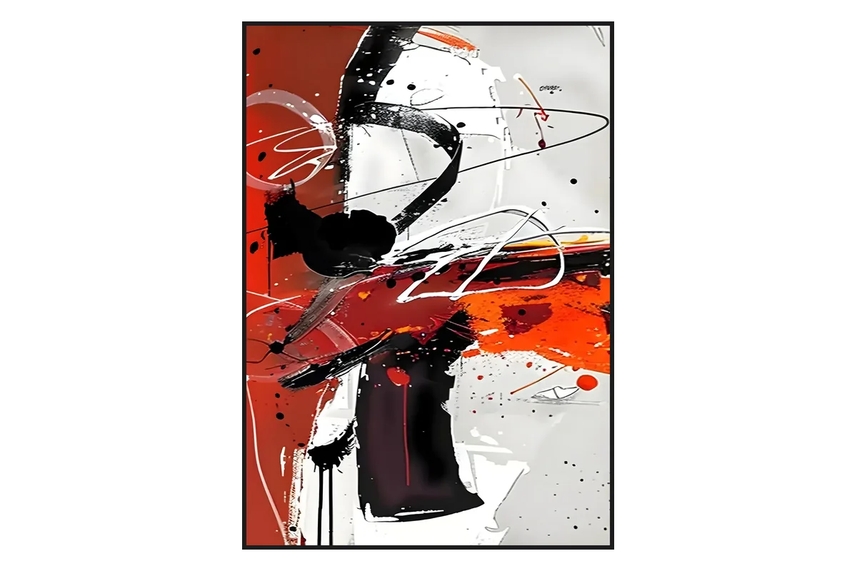
Lyrical abstraction. A softer, more poetic relative of action painting, focused on fluid compositions, soft color transitions, and a gentle sense of harmony. It often evokes natural elements like water, wind, or mist without ever drawing them literally.
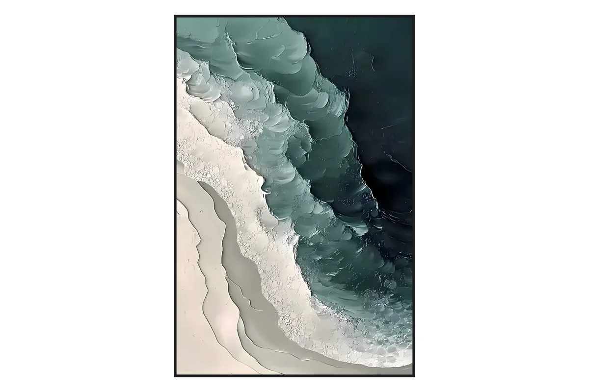
Minimalist abstract art. Built on the philosophy of “less is more.” It strips the artwork down to its bare essentials, often using a highly restricted palette, sometimes just two or three tones, and vast amounts of empty space to create an echo chamber of quietude. You can see this discipline at work across our contemporary minimalist canvases.
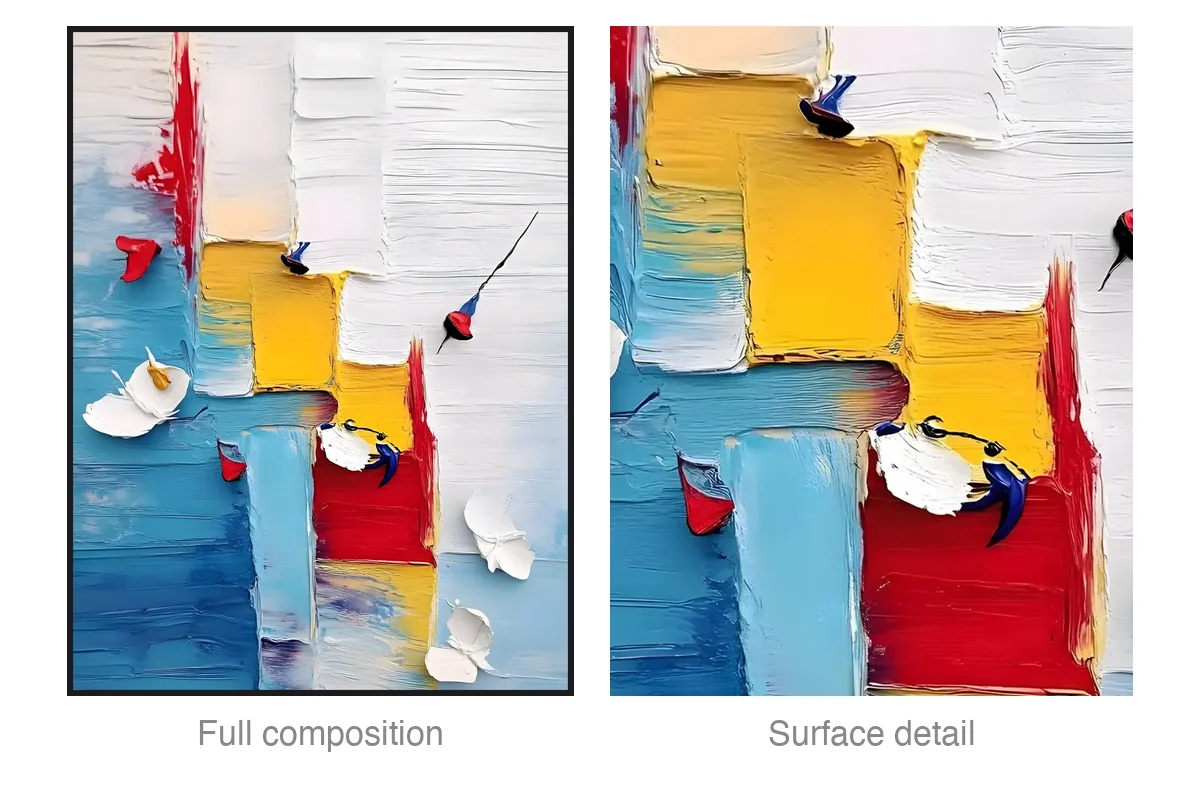
These categories are not rigid boxes. The most compelling contemporary paintings often live on the boundaries. Take the red and yellow blocks relief painting (TA05) from our own abstract collection: from across the room it reads as a structured composition of stacked primary-color blocks, but step closer and the surface turns out to be pure palette-knife texture, thick, uneven, and unmistakably handmade.
Geometric bones, organic skin. That blend is exactly where a lot of the best contemporary work lives.
A short history of abstract art: from Hilma af Klint to today
So where did all these styles come from? The backstory is shorter, and stranger, than you might expect.
For centuries, Western painting had a job, which was to record the world, the gleam of silk, the texture of fruit, the likeness of a king. Then photography arrived and did that job in three seconds. Why spend three weeks painting a duke’s face when a camera could capture it instantly?
Painters were effectively laid off from their oldest occupation, and it was the best thing that ever happened to them. Freed from documentation, they turned inward, toward emotion, psychology, and spiritual expression.
For decades, textbooks credited the Russian painter Wassily Kandinsky as the “father of abstract art,” pointing to his first fully non-objective watercolors created around 1913.
Modern art history has since corrected that narrative by giving overdue recognition to Hilma af Klint. The Swedish artist was creating large, entirely abstract paintings as early as 1906, years before her male counterparts, driven by a deep interest in spiritualism and the unseen forces of the universe.
Her landmark 2018 retrospective, Paintings for the Future, became the most-visited exhibition in the Guggenheim Museum’s history, a sign of just how dramatically the story of abstraction is being rewritten.
By the 1920s and 30s, movements like De Stijl in the Netherlands and Suprematism in Russia pushed abstraction to its limits, stripping art down to basic grids and primary colors. But the real global explosion came in post-war New York during the 1940s and 50s with the rise of Abstract Expressionism.
Artists like Jackson Pollock, Mark Rothko, and Joan Mitchell turned the art world on its head, proving that a painting did not need a physical subject to be profoundly moving.
It helps to keep the hierarchy clear. Abstract art is the large historic umbrella. Abstract Expressionism is one American branch of that tree. Impressionism is separate, since Monet and Renoir were still painting real lily pads and real people, just through a loose, blurry lens. True abstract art has left the physical object behind entirely to focus on pure feeling.
What’s the point of abstract art? (and is it even really art?)
We’ve all heard the gallery complaints: “My five-year-old could paint that,” “It looks like an accident,” or “Is abstract art just a scam to trick wealthy collectors?” These are fair questions to ask in front of a canvas that seems to defy traditional standards of technical skill.
To understand the purpose of abstract art, you have to understand why it exists. By refusing to give you a recognizable subject, the artist performs a radical act: they hand the power of interpretation back to you. When you look at a painting of an apple, your brain instantly labels it apple, notes its color, decides whether you like the taste, and moves on. Your logical brain categorizes it and shuts the experience down.
Abstract art works more like instrumental music. A cello sonata has no words, and it isn’t trying to imitate the sound of a train or a bird. It uses pitch, rhythm, and volume to make you feel melancholy, triumph, or peace.
Abstract art does the same thing with visual tools. Because it doesn’t dictate a rigid story, its open-ended nature is its greatest strength. You can pass the same painting in the hallway for ten years and, depending on who you are that day, read a completely different emotional story in it.
As for the “my kid could do that” argument, there is a real difference between accidental chaos and deliberate abstraction. A toddler splashing paint is playing with raw materials, which is wonderful, but they are not making conscious critical decisions. A skilled abstract artist makes hundreds of intentional choices:
- They decide exactly where a sharp edge should meet a soft smudge.
- They manage the weights of contrasting colors so they don’t turn into mud.
- They understand the physics of balance, tension, and composition.
- Most importantly, they have the judgment to know when to lift the brush and stop.
The true mastery of abstract art is not the ability to draw a photographic likeness. It is the power of visual judgment: knowing what to leave out so the emotional core shines through. When an artist’s judgment is locked in, you can feel it, and when it’s missing, the piece falls flat.
What is good abstract art? How to tell quality from filler
Academic essays talk endlessly about theory, historical context, and philosophy. But when you’re simply looking at a canvas and wondering whether it’s any good, you need a practical framework. Here is an honest checklist for telling high-quality abstract art from cheap filler.
1. Staying power. This is the ultimate test. Buying art is less like a first date and more like a marriage: the question isn’t whether it dazzles you today, but whether it still has something to say in year five.
Before you look at the price or the dimensions, watch your own reaction. Does it make you breathe a little slower, or give you a spark of creative energy? A great piece keeps giving something back the tenth, fiftieth, or five-hundredth time you sit across from it. If a painting’s only quality is that it matches the exact teal of your throw pillows, it’s not art, it’s a textile extension, and you’ll be bored of it within months.
2. Spatial harmony and scale. A painting should suit the energetic purpose of its room. For a bedroom, works with horizontal lines, a restrained palette, and gentle, blended transitions help the nervous system wind down. For a lively dining room or an active entryway, pieces with vertical tension, high-contrast values, and energetic marks spark conversation.
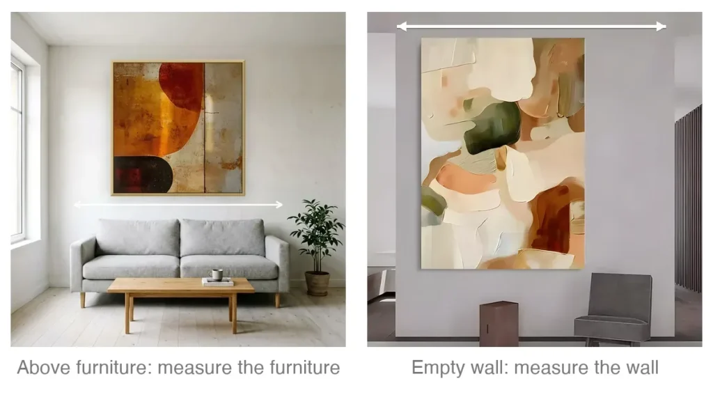
Size matters too. A common mistake is a canvas that’s far too small, left looking lost on a vast wall. A good rule of thumb: aim for an artwork that covers roughly two-thirds to three-quarters of the width of the furniture below it (sofa, sideboard, or bed). The visual center should sit around 57 inches (about 145 cm) off the ground, standard eye level, rather than floating up near the ceiling.
3. Compositional flow. Step back and watch how your eyes travel across the canvas. Good abstract art guides your gaze along an intentional path, with clear focal points where the paint is dense or vivid, balanced by quiet open areas where the eyes can rest. If a painting is equally frantic across every square inch with no breathing room, it’s usually a sign of an amateur hand that didn’t know how to edit itself.
4. Surface texture: original versus print. This is the single biggest tell of abstract art that looks expensive and timeless. There is an enormous difference between a flat giclée print and a genuine hand-painted original. A cheap print is a two-dimensional photograph of a painting: flat, plastic, and lifeless. It can’t interact with its environment, and it looks exactly like the mass-produced art in a corporate hotel room.
An original hand-painted piece is a living, three-dimensional object. When an artist uses heavy impasto or a palette knife, as in our textured and plaster paintings, they build real physical ridges of oil or acrylic paint on the canvas. Those ridges catch the light in the room.
As the sun rises, hits the painting from a side angle at noon, and fades into warm lamplight at night, the artwork literally changes appearance. The small shadows cast by the thick strokes move, making the piece feel dynamic and alive. It carries the unmistakable warmth of human craft, so a room never feels sterile.
Choosing well, then, is less about matching cushions and more about finding a piece whose mood and surface you’ll still want to live with years from now.
Examples of abstract art: from famous pieces to everyday walls
To bridge art history and a home, it helps to look at classic examples of abstract art alongside everyday applications. In major museums, these principles operate on a historic scale:
- Jackson Pollock’s drip paintings are masterclasses in gestural action, where the entire surface vibrates with chaotic, athletic energy.
- Mark Rothko’s stacked color fields show how simple blocks of dark plum and luminous orange can create an overwhelming sense of quiet reverence.
- Piet Mondrian’s red, yellow, and blue grids demonstrate how pure geometry can create a clean, timeless balance.
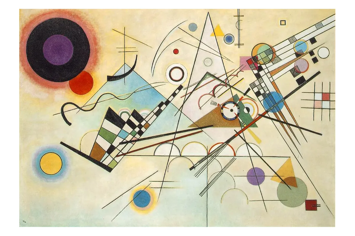
- Wassily Kandinsky’s sweeping compositions show how colors and lines can flow together like a symphonic score.
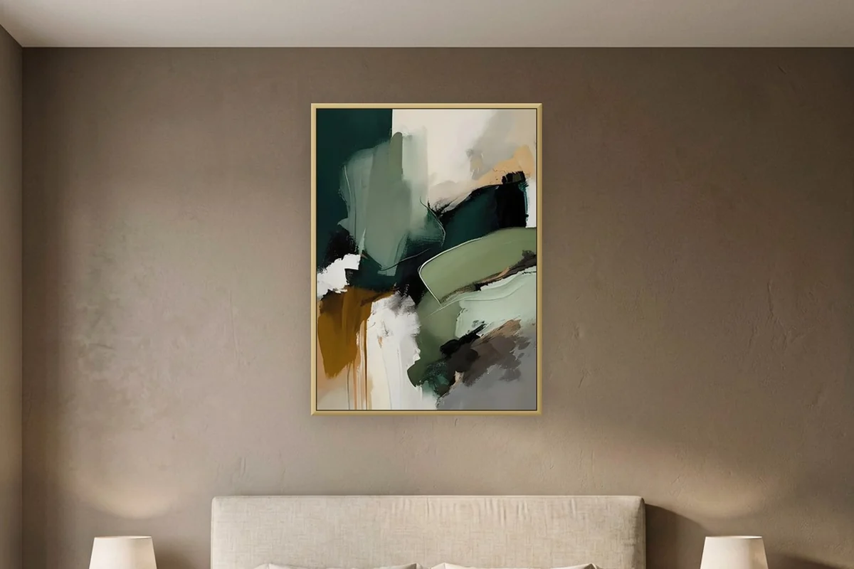
You don’t need a museum budget to experience this. In a home, abstract art anchors daily life. Picture a low-saturation earthy color field painting with deep palette-knife texture on a bedroom accent wall: it reads as a tactile, restful sanctuary.
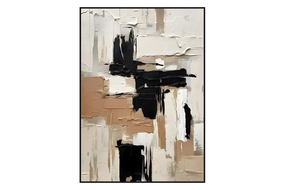
In a contemporary living room, a large white canvas with bold minimalist black strokes can pull a scattered room together, giving it an architectural edge without fighting the furniture.
When you choose an example of abstract art for a home, remember that you’re choosing the emotional weather of that room. Take your time, focus on the physical quality of the paint, and trust what your eyes tell you.
Conclusion
Learning to “get” abstract art is liberating, because you realize you don’t need a degree in art history to appreciate it: a painting isn’t a puzzle about what object it represents, it’s a question of how it makes you feel when you stand in front of it.
So when you choose a piece to live with, let your own reaction be the compass, and favor work that carries the real texture, weight, and depth of a human hand over flat, disposable prints. If you’d like to see what that looks like on real walls, explore our hand-painted abstract collection.
Frequently Asked Questions
What is semi-abstract art?
Semi-abstract art occupies the middle of the spectrum. The artwork still contains a recognizable object, figure, or landscape, but the artist has heavily stylized, fragmented, or simplified it to emphasize feeling over accurate detail.
What is the opposite of abstract art?
The direct opposites are representational, figurative, or realistic art, all of which depict objects and scenes exactly as they appear in objective physical reality.
What is non-representational art?
Non-representational art is another technical term for pure abstraction. It refers to work that makes no reference whatsoever to real-world objects, figures, or settings, relying purely on its own internal visual language.
What emotions does abstract art evoke?
There is no single correct answer. Because it relies on color and composition, a sharp geometric piece might evoke mental clarity and order, while a soft, misty lyrical abstraction might evoke peace, nostalgia, or quiet melancholy.
What is abstract art for kids, explained simply?
Abstract art means painting your inside feelings, your dreams, or the rhythm of your favorite music using wild shapes and bright colors, instead of trying to draw a real cat, dog, or house.
Why do people like abstract art?
People connect with abstract art because it honors the viewer. It gives the mind freedom to explore, offering an emotional connection and a visual complexity that doesn’t grow predictable.
Why is abstract art so expensive?
Multi-million-dollar museum paintings are expensive because of historical rarity, name recognition, and market speculation. For everyday artists, a high-quality original is an investment because it reflects weeks of design work, high-grade materials, and the labor of building unique physical texture by hand, something a flat machine print can’t replicate.