

Each PaletteMomento piece is an original, made to order and finished entirely by hand.
Built to last and easy to install. Every piece is made to look right on the wall and stay that way for years.
Make it truly yours. Beyond size and color, we can paint almost anything you can imagine.
Every painting is created the slow way, by hand, by real painters, one canvas at a time.
Nothing leaves the studio that you have not already seen and signed off. We work with you at every step, so there are no surprises on arrival.
Packed the way your project needs it. Prices are EXW our Shenzhen studio, so the freight stays visible and separate.
Any size outside this list is produced to your dimensions at the same rate.
Rolled Canvas
Frameless Stretched
Black Frame
White Frame
Wood Frame
Silver Frame
Gold FrameWhatsApp: usually an immediate reply. Email: usually within 12 hours.
Or email support@palettemomento.com
We paint every piece to order in Dafen, Shenzhen, so the size, the palette and the finish are all decided by your project rather than by what happens to be in stock. You see photographs of the finished canvas before it ships, and nothing leaves the studio until you approve it. Trade pricing starts at one piece, and the rate improves as the count goes up.
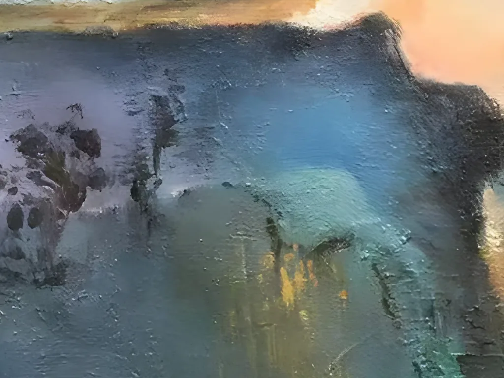
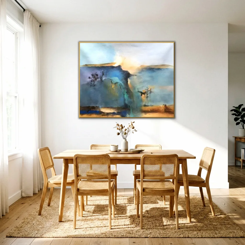
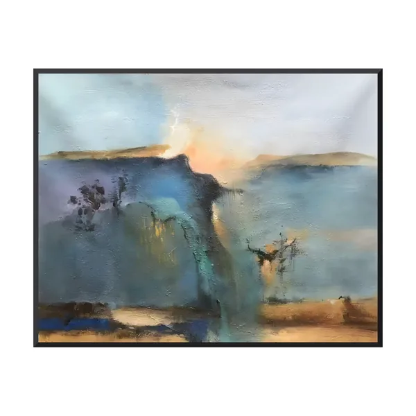
Start at the dark cliff on the left. Its top edge climbs to a sharp point just left of center, then drops away. Right behind that drop, an apricot glow lifts into a pale sky, so the darkest and the brightest paint meet in one spot. Thin drips hang from the cliff edge, and a streak of jade green slides down its face next to a few flecks of mustard gold. On the far left, the blue softens into lavender haze around a cluster of dark plum dabs, like a small tree. Two flat ochre ridges lie on the horizon, one on each side, and keep the glow from floating loose.

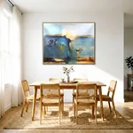
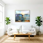
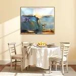
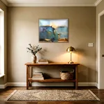
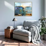
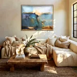
Most of this canvas is cool teal and slate blue, with warm notes of apricot and ochre. That mix makes it easy to place. On cream plaster or warm white, like the dining room shown here, the glow looks brighter and the blue looks deeper. A taupe or greige wall, as in the dining room and entryway photos, brings out the two ochre ridges. Oak, walnut, linen and jute repeat the warm bands at the bottom, and a brass lamp picks up the glow. As teal abstract art for a living room, it suits the wall above a sofa or sectional. As a blue and peach abstract canvas for a dining room, it fills the space over a sideboard. In a hotel lounge or a meeting room, the misty view gives people a soft place to rest their eyes.

Every AA15 starts on bare premium linen when the order comes in. One painter handles it from the first sketch to the final stroke, and nobody else works on it. The cliff line and the horizon are sketched and blocked in first. Then the painter mixes the teal, slate, apricot and ochre on the palette, checking each one against this design. The sky is dragged with a knife so its thin white ridges stay raised, and the drips under the cliff edge are kept. We paint in acrylic unless you ask for oil. Oil is available on request and takes longer. On WhatsApp you get photos and short videos as the painting goes, and you approve daylight photos of the finished canvas before it is released.
One to five pieces take about 7 to 10 business days. Six to twenty pieces take about 10 to 15. The 72 and 84 inch sizes sit at the longer end, since one painter covers the whole surface alone.
The whole painting turns on one point. A dark teal cliff climbs from the left, and its top edge drops sharply just left of center. In that gap, an apricot glow lifts into the sky. The eye lands there first, because that is where the darkest and the brightest paint meet. From the glow, it drifts right over calm slate blue, then down to the warm ochre and caramel bands at the bottom. Nothing is drawn in detail, so the scene never becomes a real place. That keeps AA15 open. A guest in a hotel lounge or a client in a waiting room can see a coast, a canyon or simply color and light.
Cool color fills most of the canvas. Teal, slate blue and lavender cover the cliff and the open space on the right. In color research, blue is one of the colors most often linked with calm, though the light and the wall color in a room always change how it feels. The warm notes do the rest of the work. Apricot glows behind the cliff, ochre sits on the two far ridges, and sand and caramel run along the bottom. Blue and orange sit opposite each other on the color wheel, so the small warm areas look stronger next to so much blue. A deep cobalt block in the lower left and the dark plum dabs give the eye solid shapes to hold.
Early in the twentieth century, painters began to let color and shape stand on their own, without copying what they saw. Some abstracts leave nature behind completely. Others, like AA15, keep just enough of it to hint at land, sky and water. In the 1950s, some Color Field painters used large, soft areas of color that suggested landscape while staying abstract, and this canvas sits near that idea. The ochre ridges suggest a horizon and the cliff has a clear edge, yet there is no path, house or tree you could point to on a map. Work like this is often called an abstract landscape. It carries the feeling of a place, so one design suits projects in many countries.
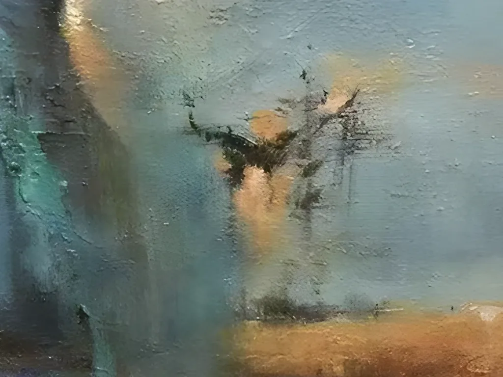
The texture changes from top to bottom, and that helps the depth. The sky is pulled sideways with a knife, which leaves thin white ridges in the pale blue. They catch side light, so the sky can look a little different in the morning and the evening. The cliff is rougher. Its surface breaks into dark flecks and small raised bits, and thin drips hang from its edge. The open blue on the right is smoother, with soft horizontal strokes. At the bottom, the ochre and cobalt bands are laid on in short, loose blocks. The result is a low, real texture you can see in the close-ups, not a heavy plaster relief.
AA15 is about four units wide for every three tall. That shape is taller than a panorama, so it fills a wall without leaving a tall empty space above it. Use the two thirds rule as a start. Over an 84 inch sofa, the 60 by 45 inch size looks right. Over a 72 inch sideboard or a long desk, try 48 by 36 inches. The 84 by 63 inch size suits a lobby or a restaurant wall where people see it from far away. In a home, hang the center about 57 to 60 inches from the floor. Any size outside the list is painted to your measurements in the same proportions.
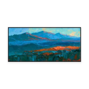
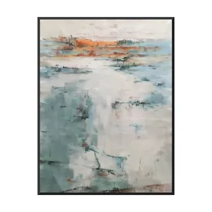
Two designs hang well near AA15. The deep blue headland with orange light (IA90) shows a coastal cliff in bolder knife strokes with the same blue and orange contrast, so the pair works along one corridor. For a narrow wall nearby, the pale teal and orange textured abstract (AA25) repeats the teal and a warm band in a tall, lighter shape.
Above furniture, start at about two thirds of its width and keep 8 to 10 inches between the furniture and the frame. Each canvas is painted for the order, and the daylight photos you approve come before anything leaves Shenzhen.
No real place is named. A dark teal cliff fills the left side, and its sharp edge drops away just left of center. An apricot glow lifts behind it, and calm slate blue stretches out on the right like still water. Ochre ridges lie on the horizon, and sand and caramel bands run along the bottom. Some people see a cliff at first light. Others enjoy it simply for the color and the texture.
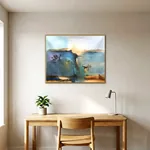
Warm white, cream and greige are the easiest choices. They let the apricot glow stand out and keep the blue from feeling cold. Taupe works well too, as the dining room and entryway photos show, because it picks up the ochre ridges. A soft blue gray wall, like the reading corner here, gives a calm tonal look. Skip a bright orange or bright teal wall, which competes with the painting instead of framing it.
Aim for about two thirds of the furniture width. Over an 84 inch sofa, that is about 56 inches, so the 60 by 45 inch size fits well. Over a 72 inch sideboard, choose 48 by 36 inches. The canvas is a 4 by 3 rectangle, a little taller than a panorama, so it also fills the wall above a queen bed or a long desk without leaving a big gap.
Yes. The apricot glow can move toward soft gold or blush, and the blue can lean greener or grayer to match a scheme. Small details can change too, such as leaving out the plum dabs on the left or warming the bottom bands. Send a photo of the room or a paint chip, and the colors are mixed against it on the palette.
Yes, but the texture is low. The sky has dragged white ridges that show in side light, and the cliff has a rough, flecked surface with thin drips. The open blue on the right and the bands at the bottom are smoother. It is not a plaster or 3D relief piece, so it hangs close to the wall and fits a slim frame.
The layout and the palette stay the same on each piece, with the cliff on the left, the glow behind its edge, the two ochre ridges and the warm bands at the bottom. The drips, flecks and knife marks change a little from canvas to canvas, because each one is painted by hand. For a hotel run, the painter works from one sample you have approved.
A thin gold or light wood frame repeats the apricot and ochre, which is the look in the room photos. A thin black frame, as on the main image, sharpens the dark cliff and suits modern spaces. White and silver frames are offered too. You can also order it stretched with no frame, or rolled in a tube, which is the most compact way to ship.
Send AA15 with the sizes, the number of pieces and the delivery address with postcode on WhatsApp, where you usually get a reply right away. Email works too, with a reply usually within 12 hours. There is no minimum order. Prices are EXW our Shenzhen studio, and freight is quoted separately once the destination is known, to your door or to your own forwarder.