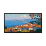
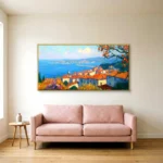
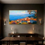
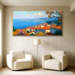
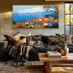
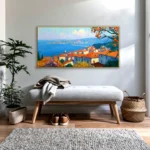
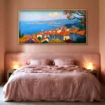
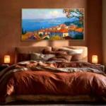
Each PaletteMomento piece is an original, made to order and finished entirely by hand.
- Availability: Made to order, no minimum quantity
- Production: 7 to 10 business days for 1 to 5 pieces, 10 to 15 for 6 to 20, 15 to 20 for 21 to 50, 20 to 30 for 51 to 100
- Sizes: Any size on this page, or painted to your own dimensions at the same rate
- Finishes: Rolled / Stretched / Framed (Black / White / Wood / Silver / Gold, all one price)
- Material: Artist grade oil & acrylic on cotton, poly cotton or premium linen canvas
- Delivery terms: EXW our Shenzhen studio. Your forwarder collects, or we arrange freight and quote it separately
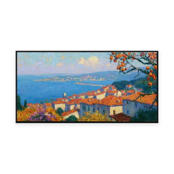
- Style: Impressionist, Colorful
- Color: Blue, Orange
- Theme: Mediterranean & Coastal
- Mood: Cozy & warm, Peaceful
- Room: Dining Room, Home Office, Living Room
- Orientation: Horizontal
Built to last and easy to install. Every piece is made to look right on the wall and stay that way for years.
- Durable, long-lasting paints on premium linen canvas, with no warping or sagging over time.
- Lightweight and easy to install; framed pieces arrive with hanging hardware included.
- Rich, saturated color and real dimensional texture that lifts any space.
- Designed in-house, so every composition is exclusive to PaletteMomento.
Make it truly yours. Beyond size and color, we can paint almost anything you can imagine.
- Custom sizes to fit your exact wall.
- Color adjustments to match your interior.
- Turn your favorite photo into a hand-painted artwork.
- Blend two photos into a single composition.
- Add personal touches such as initials, a quote, or small details like a butterfly among the flowers.
- Reach out for any bespoke commission.
Every painting is created the slow way, by hand, by real painters, one canvas at a time.
- Each design is created in-house, then hand-painted by our studio artists.
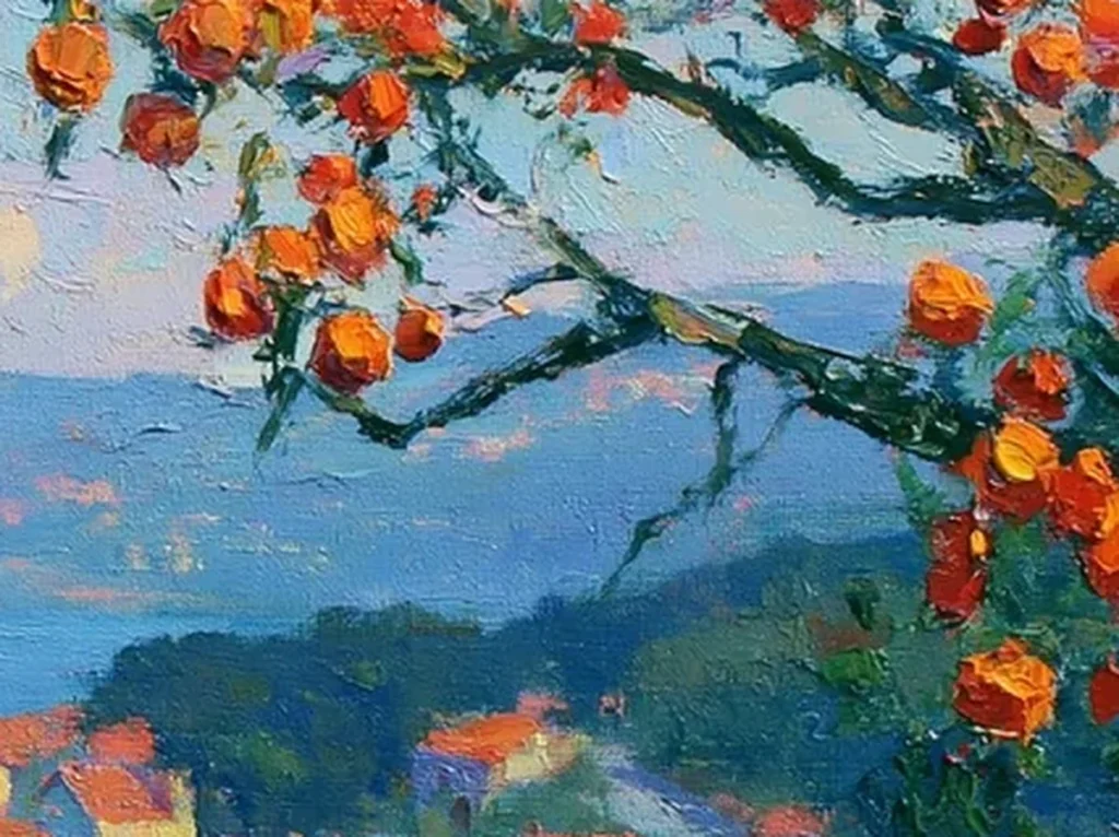
- Layered palette-knife technique for genuine texture and depth.
- No mass printing. Every canvas is individually painted to order.
- Finished, inspected, and carefully sealed before it ships.
Nothing leaves the studio that you have not already seen and signed off. We work with you at every step, so there are no surprises on arrival.
- We confirm the design with you before we begin.
- We share progress photos and ship only once you approve.
- You receive exactly what you signed off on.
- If a piece leaves us with a fault of ours, we repaint or replace it at our cost.
Packed the way your project needs it. Prices are EXW our Shenzhen studio, so the freight stays visible and separate.
- Four packing options: rolled in a tube, stretched on bars, framed, or a wooden crate for freight.
- Prices are EXW Shenzhen, so freight is quoted separately and you can always compare it against your own forwarder.
- If we arrange it: express by FedEx or DHL in 5 to 10 business days, air freight, or sea freight in 25 to 40 days.
- CIF and DDP can be quoted if you would rather we handle the duty.
- For volume, rolled canvas is by far the cheapest to ship. We will tell you the crate count up front.
- Anything damaged in transit is repainted or replaced at our cost.
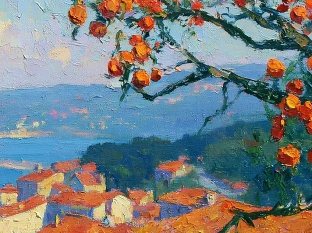
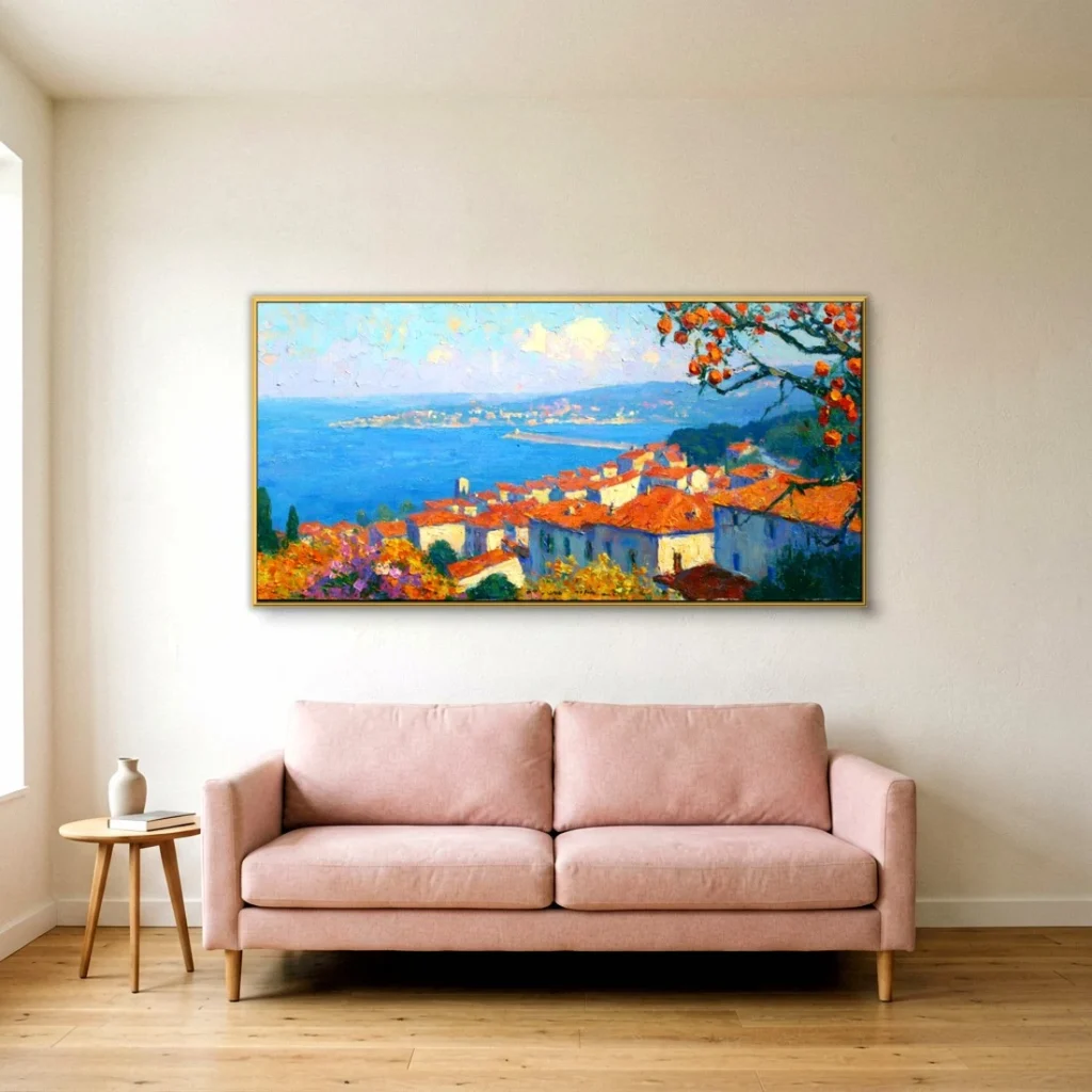
Terracotta rooftops and citrus over sea impressionist painting IA50
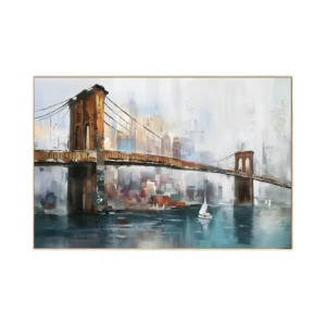
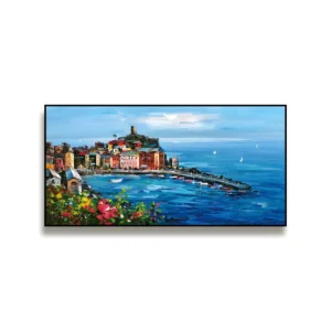
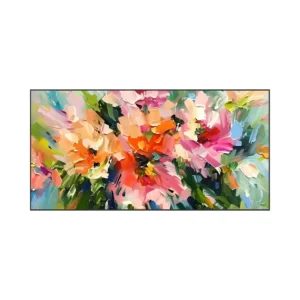
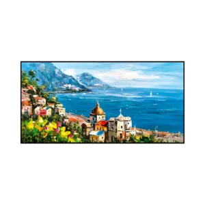
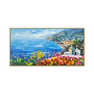
- 36"Wx 18"H91 x 46 CM
- 60"Wx 20"H153 x 51 CM
- 48"Wx 24"H122 x 61 CM
- 72"Wx 24"H183 x 61 CM
- 60"Wx 30"H153 x 76 CM
- 80"Wx 30"H203 x 76 CM
- 90"Wx 30"H229 x 76 CM
- 72"Wx 36"H183 x 91 CM
- 80"Wx 40"H203 x 102 CM
- 90"Wx 45"H229 x 114 CM
- 100"Wx 50"H254 x 127 CM
Any size outside this list is produced to your dimensions at the same rate.
 Rolled Canvas
 Frameless Stretched
 Black Frame
 White Frame
 Wood Frame
 Silver Frame
 Gold Frame
- Minimum order
- None. Trade pricing from one piece.
- Production
- 7 to 10 business days for 1 to 5 pieces, 10 to 15 for 6 to 20, 15 to 20 for 21 to 50, 20 to 30 for 51 to 100.
- Delivery
- Prices are EXW our Shenzhen studio. Collect with your own forwarder, or ask us to arrange freight and we quote it separately.
- Made
- Hand-painted in oil and acrylic on canvas. Nothing printed, nothing stock.
- Customization
- Color match, your own reference or photograph, added personal elements.
WhatsApp: usually an immediate reply. Email: usually within 12 hours.
Or email support@palettemomento.com
Working with our studio
We paint every piece to order in Dafen, Shenzhen, so the size, the palette and the finish are all decided by your project rather than by what happens to be in stock. You see photographs of the finished canvas before it ships, and nothing leaves the studio until you approve it. Trade pricing starts at one piece, and the rate improves as the count goes up.